Excelsis
Sacred work, from a builder working in the highest degree.
Gloria in excelsis Deo, glory to God in the highest, is one of the oldest surviving lines in Christian liturgy, and the source of Excelsis Projects' name: a claim to centuries of faith and history. The company builds, restores and beautifies places of worship and community spaces. Its identity was built to carry that weight with restraint.
The brief called for a visual language that would speak fluently to priests, parish boards and community leaders, an audience that would register instantly if the brand got it wrong.
Frankly Studio led the identity independently, drawing on research the director of Excelsis had gathered from travel through Italy, studying the architecture of Rome and the Vatican firsthand.
Client
Scope
Brand identity
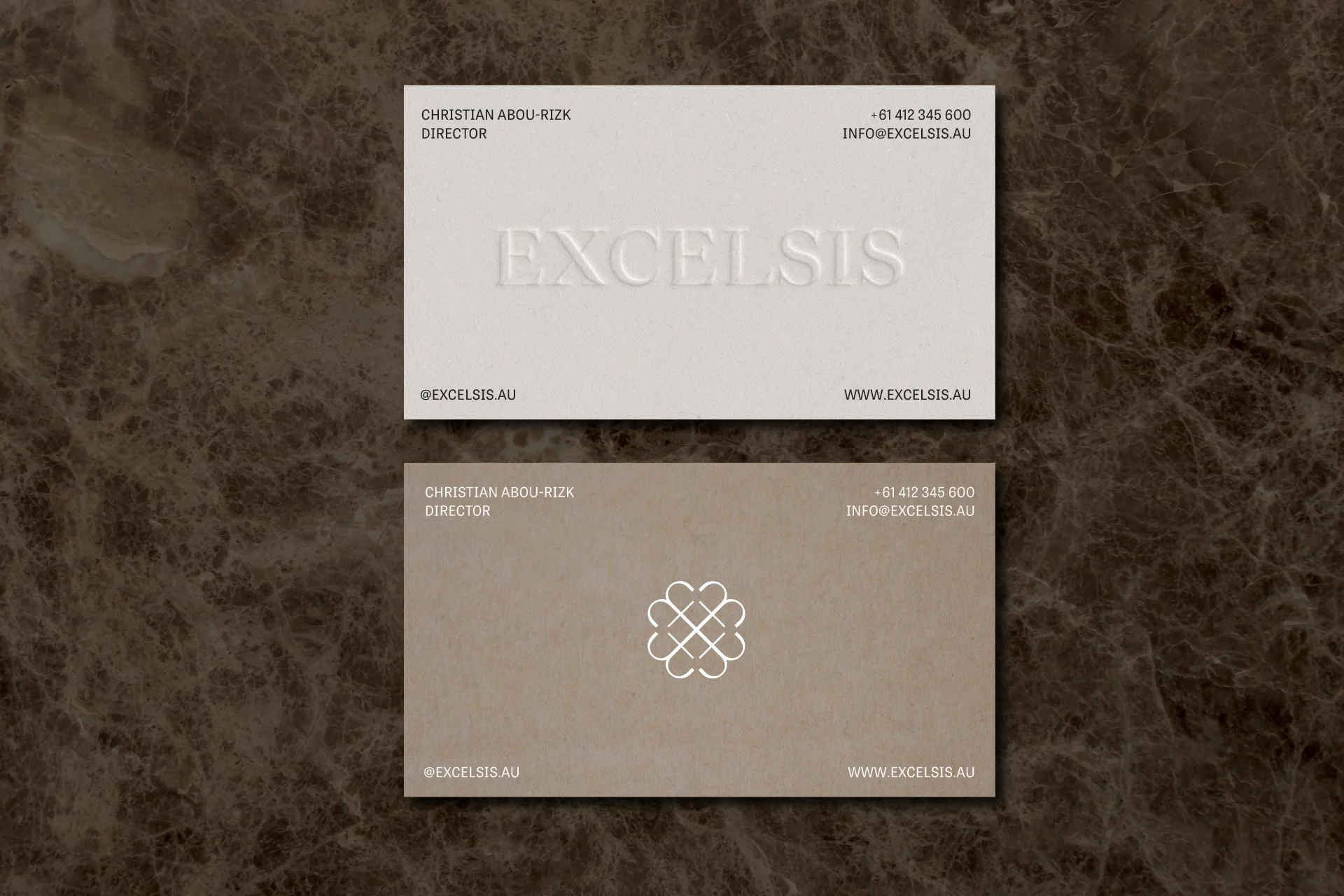
Collateral and touchpoints
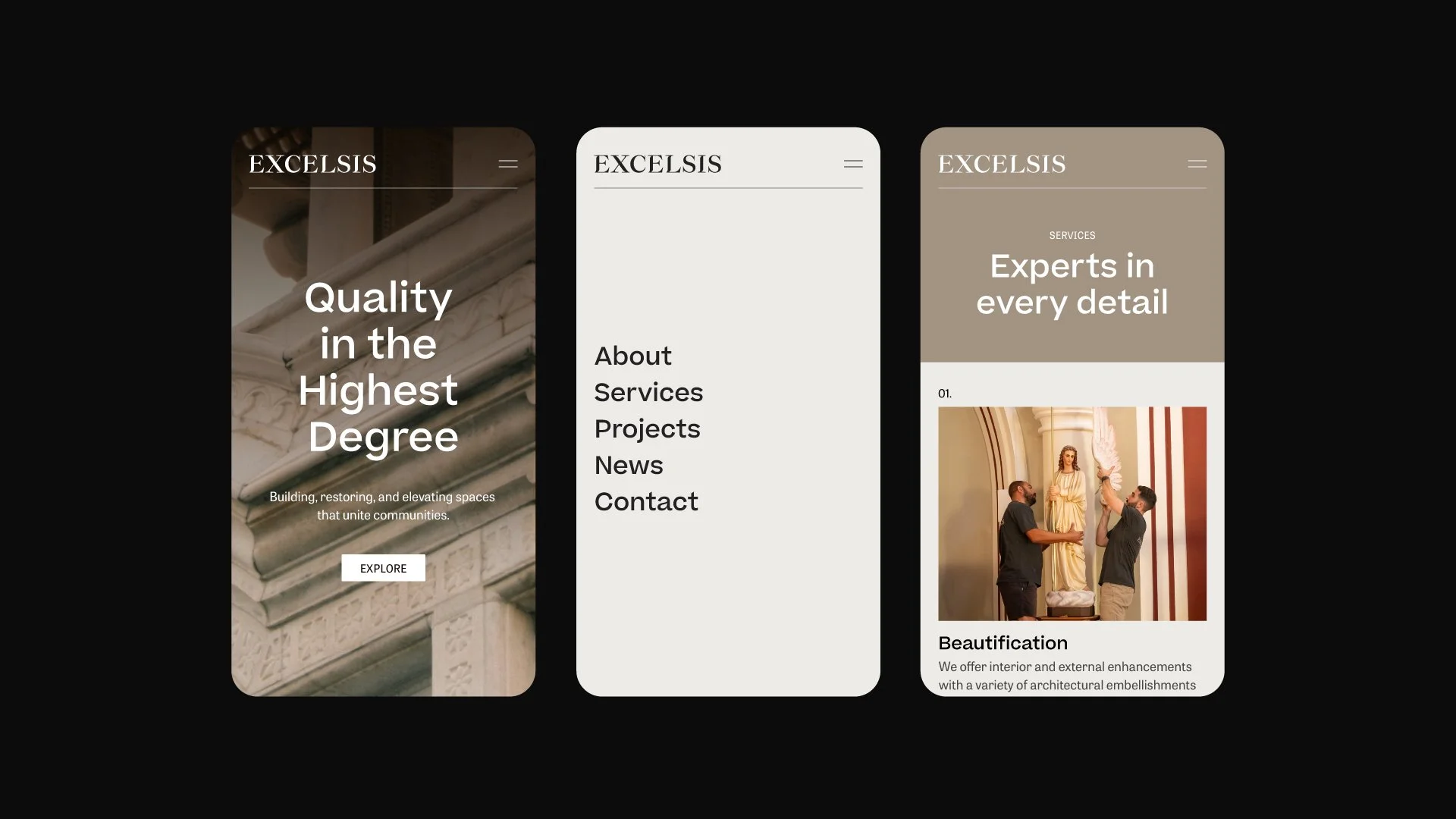
Website design & development
Social content guide
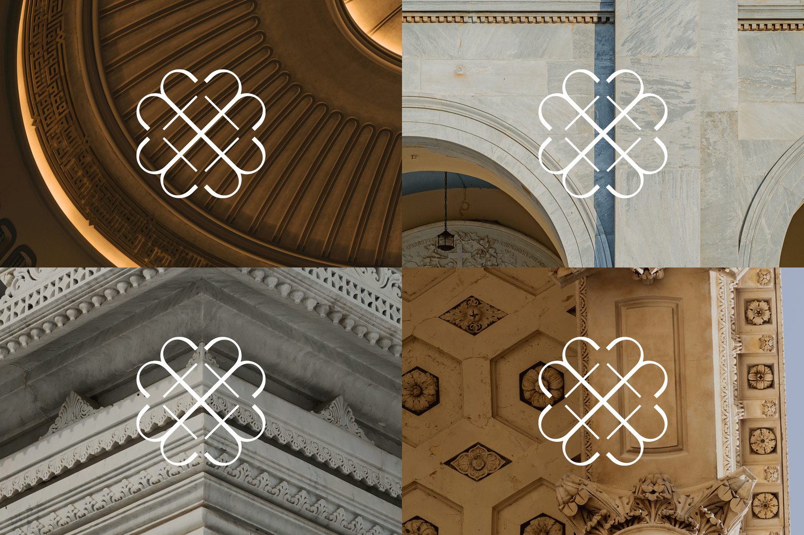
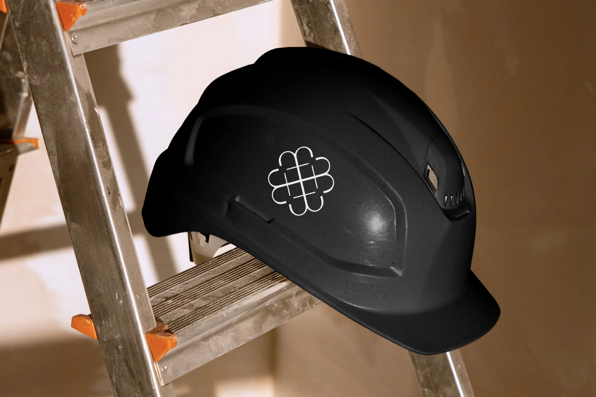
The icon is four lines, each curving inward to a shared centre, forming the X of Excelsis.
Formally, it's a quatrefoil: four overlapping circles, a shape that appears across centuries of art, architecture and heraldry. For Excelsis, the mark carries a second meaning too: the intersection of old and new, a heritage structure meeting new construction activity, distinct from a cross or any single denomination's symbol.
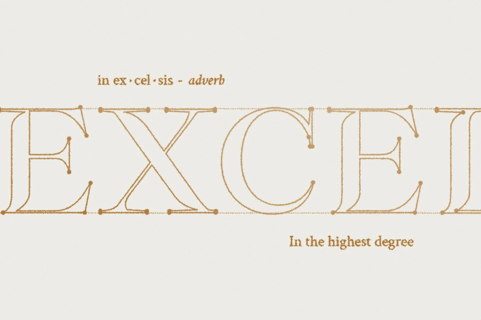
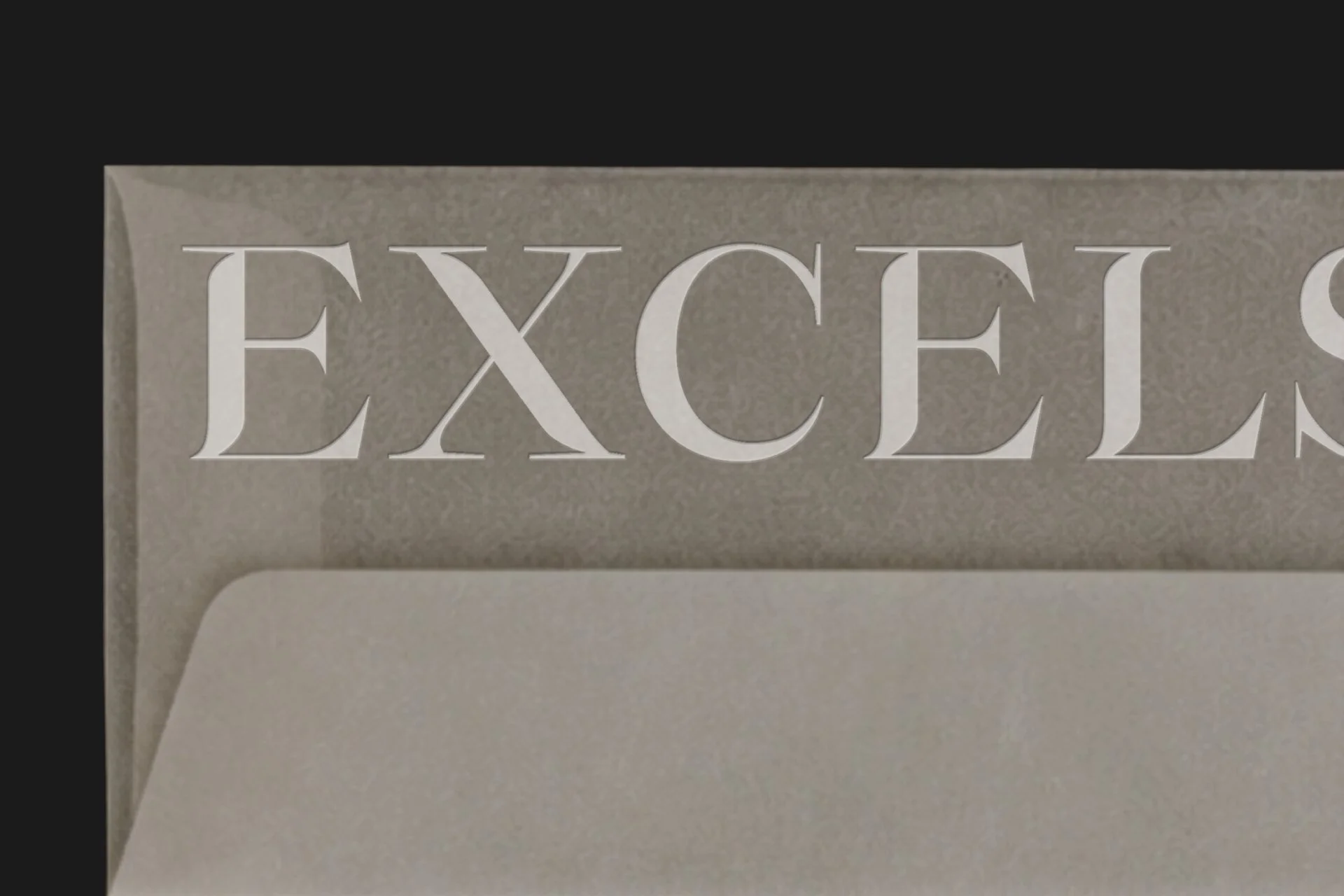
The wordmark's serif carries the same weight as Roman inscriptional lettering, permanent, precisely cut. Its strokes break and cut through, as though carved, or caught mid-restoration, the same work the business does on the buildings themselves.
Frankly Studio directed a short, local-project-style documentary on the renovation of Holy Family Catholic Church in Menai, working alongside Vert Production, telling the story of one of Excelsis's most significant restorations.