Creatures of Australia
Get close. Just don't get too close.
Cute one second, colossal the next. Creatures of Australia put the country's wildlife on screens tall enough that viewers became the prey. The identity had to carry that same swing between wonder and fear, and it had to do so before the exhibition itself was finished being built.
The exhibition came from AGB Creative, the minds behind iconic national public displays, from Sydney to Doha. Frankly led the visual identity, and collaborated on the brand strategy closely with with Marie El Daghl from Chasing Albert, who shaped the tone of voice and marketing language.
A wordmark you can prick your finger on
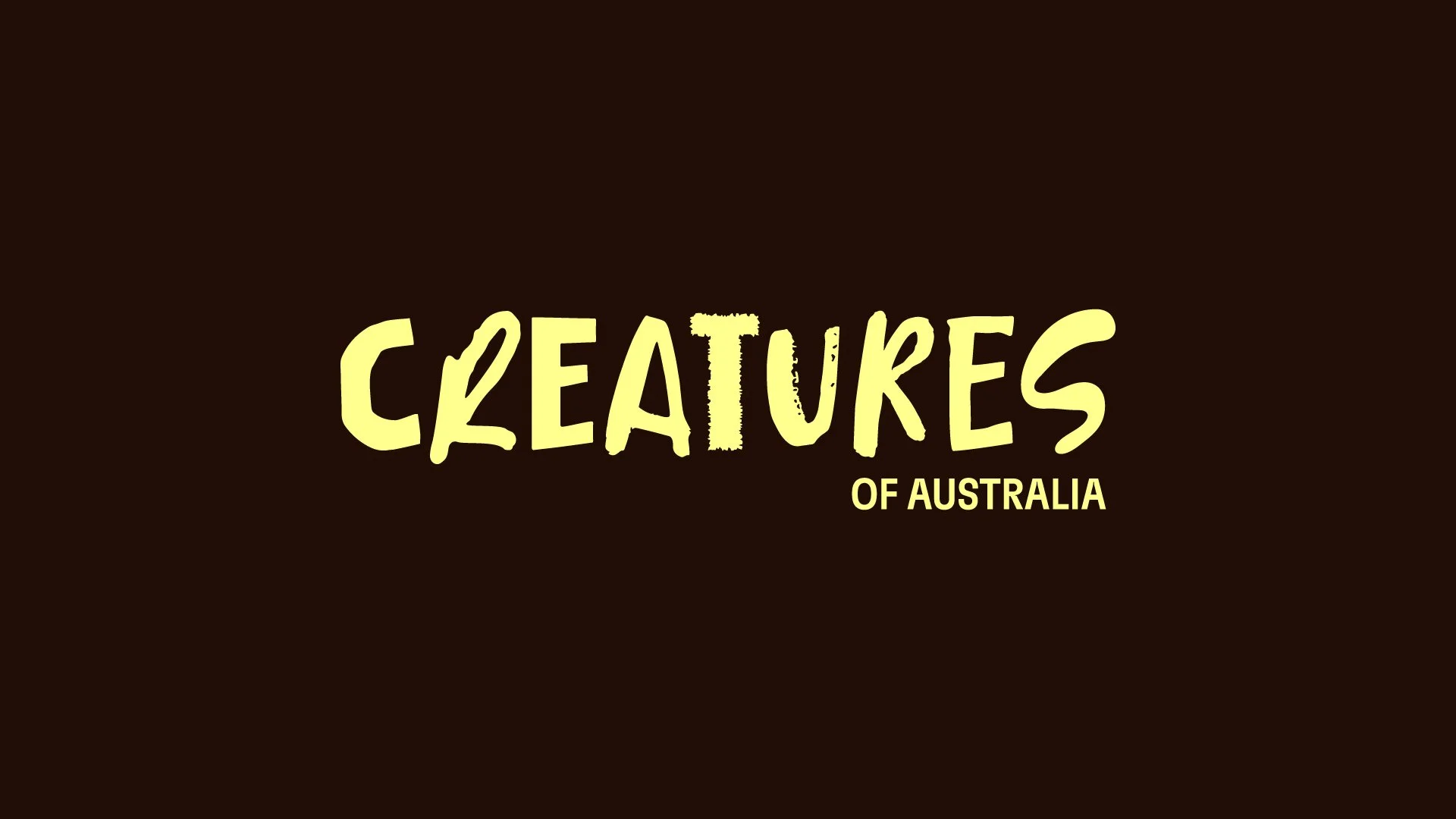
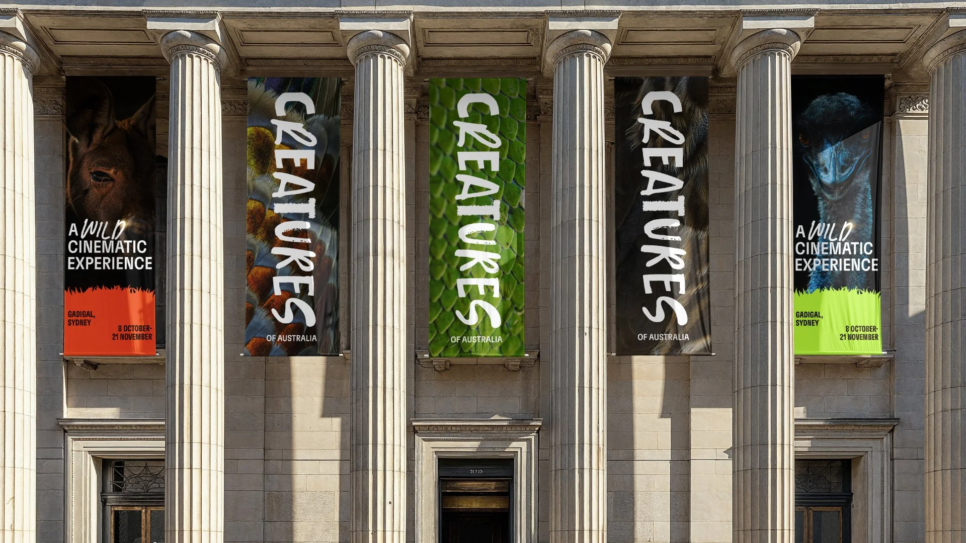
The wordmark is tied together by one theme: the untamed pulse of Australian wildlife. The C catches like an insect's exoskeleton, rough enough to draw blood. The S coils in the way a snake moves through grass. It's a wordmark built to be touched before it's read, held together the whole time by one continuous, confident hand.
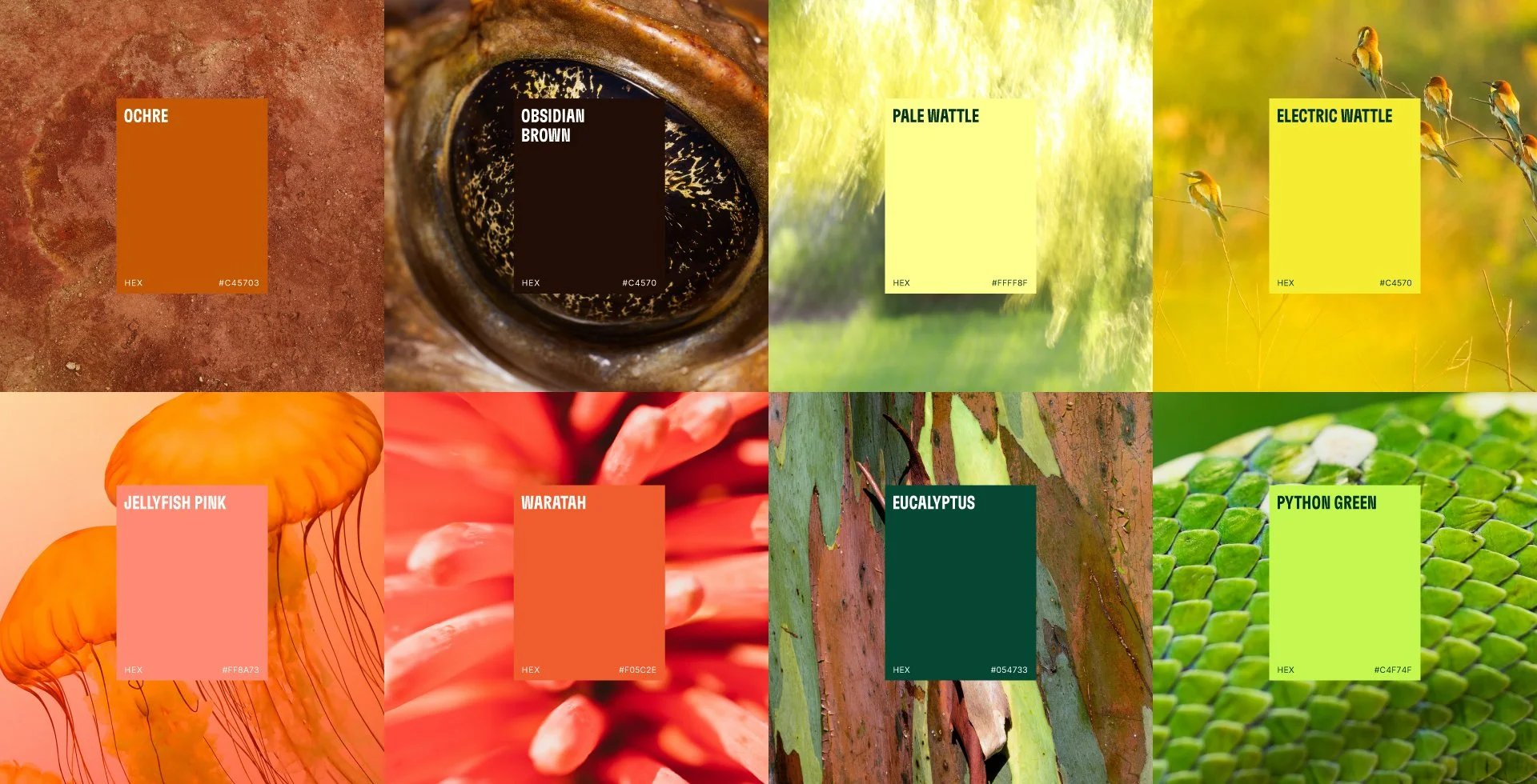
The palette doesn't sit quietly on a swatch card. It glows, every hue pulled from the real Australian landscape and pushed past what that landscape looks like in daylight.
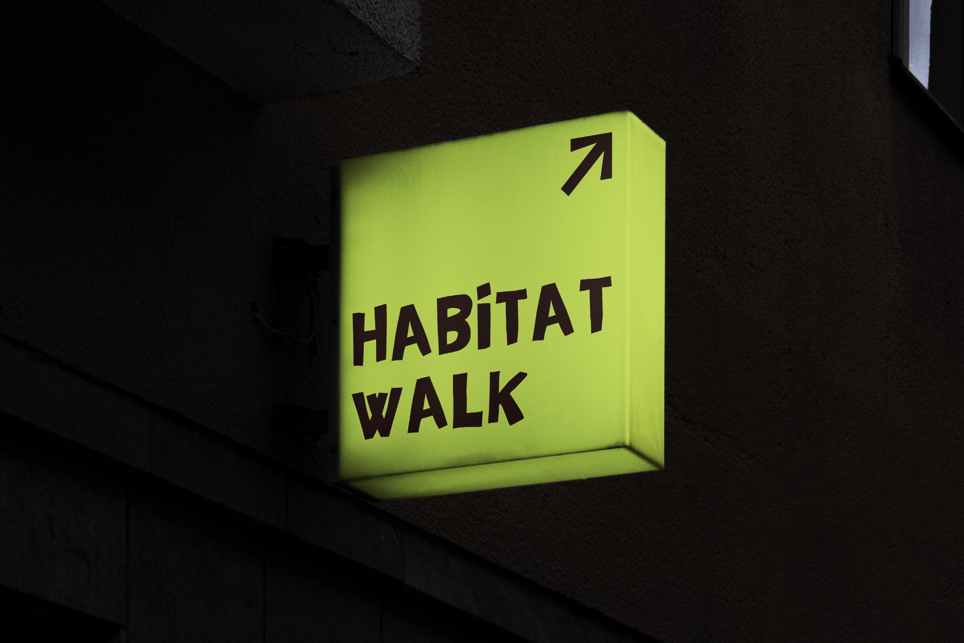
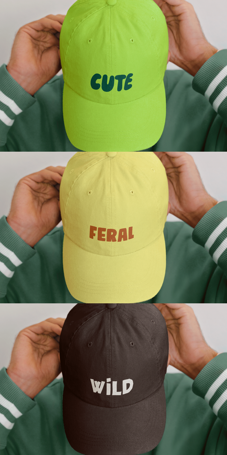
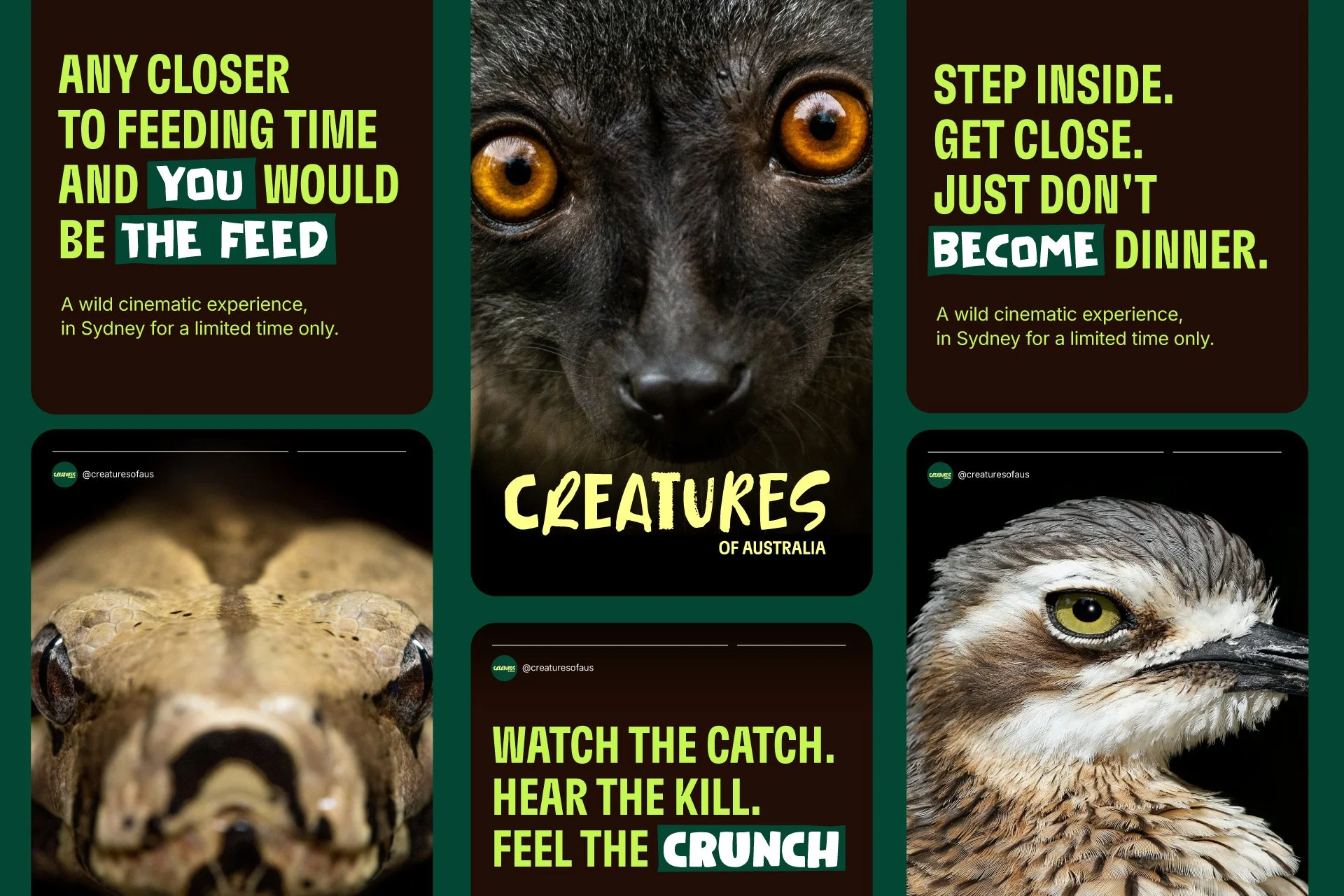
The type never sits still, stretching tall and cinematic one moment and dropping plain and legible the next, breaking rhythm entirely whenever a single word needs to shout louder than the sentence around it. Underneath sits a voice holding a nature documentary's authority and a horror trailer's nerve in the same breath.